

FORM MAGAZINE
FORM Magazine
Instructor: Jen Stern
Introduction:
This magazine project challenged me to develop a cohesive editorial design using a chosen title from a predefined list—FORM. I interpreted the name through a fashion lens, creating a bold, trend-focused publication that highlights the relationship between structure, style, and visual identity.
The project allowed me to refine my typography skills, with a strong focus on hierarchy, layout, and the integration of text with imagery. I emphasized clarity and impact through intentional type pairings and dynamic composition. Drawing from my love of bold color, I incorporated vibrant palettes and high-contrast elements to create an eye-catching, contemporary aesthetic that reflects the energy of modern fashion media.

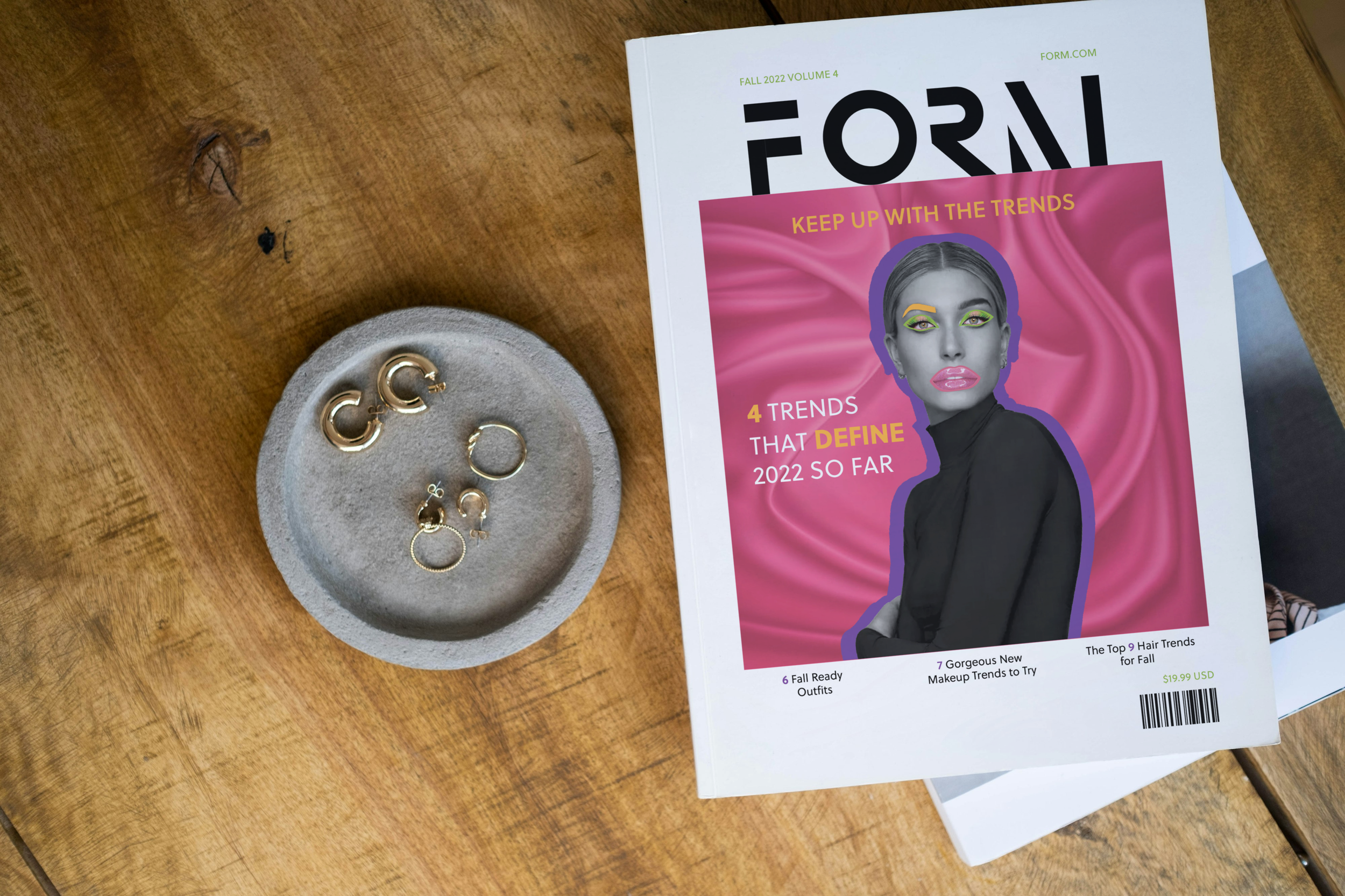
For the FORM masthead, I chose a bold, modern typeface to reflect the structure and confidence of fashion design. The clean, geometric forms emphasize both physical shape and visual identity.
I manipulated the letterforms so they aren’t fully complete—like the shortened “F” and the missing portion of the “R”—to introduce negative space and visual tension. This invites the viewer to engage with the design while reflecting the ever-evolving nature of fashion.
These subtle distortions give the masthead a custom, editorial feel that sets FORM apart and reinforces its trend-forward identity.
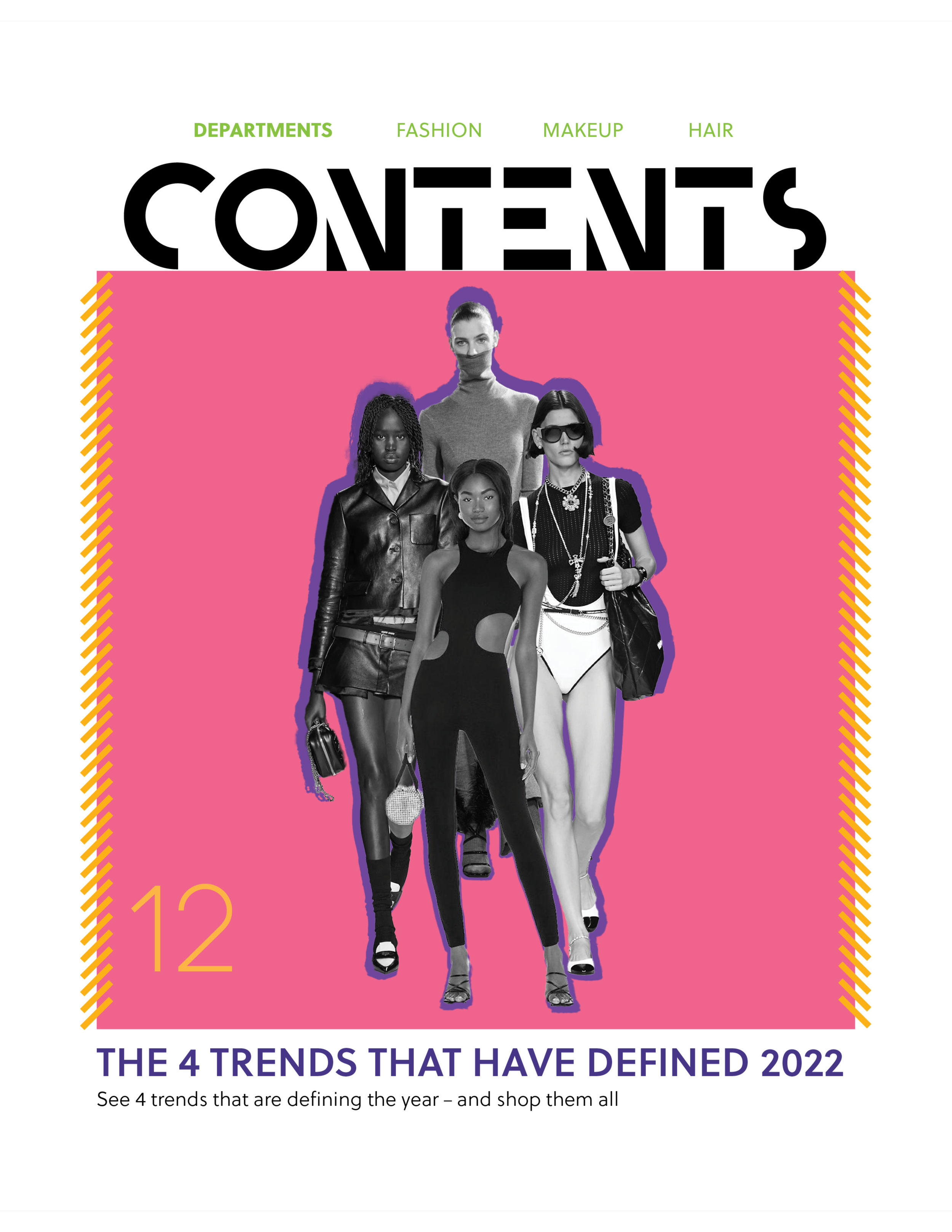
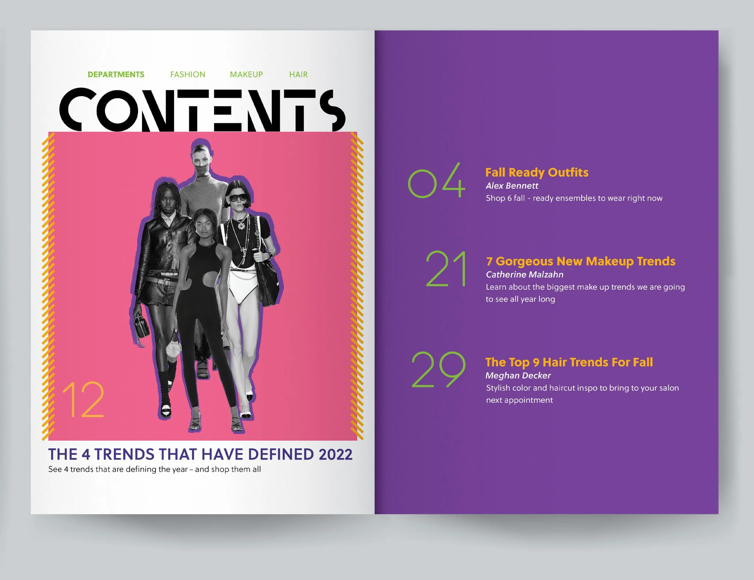
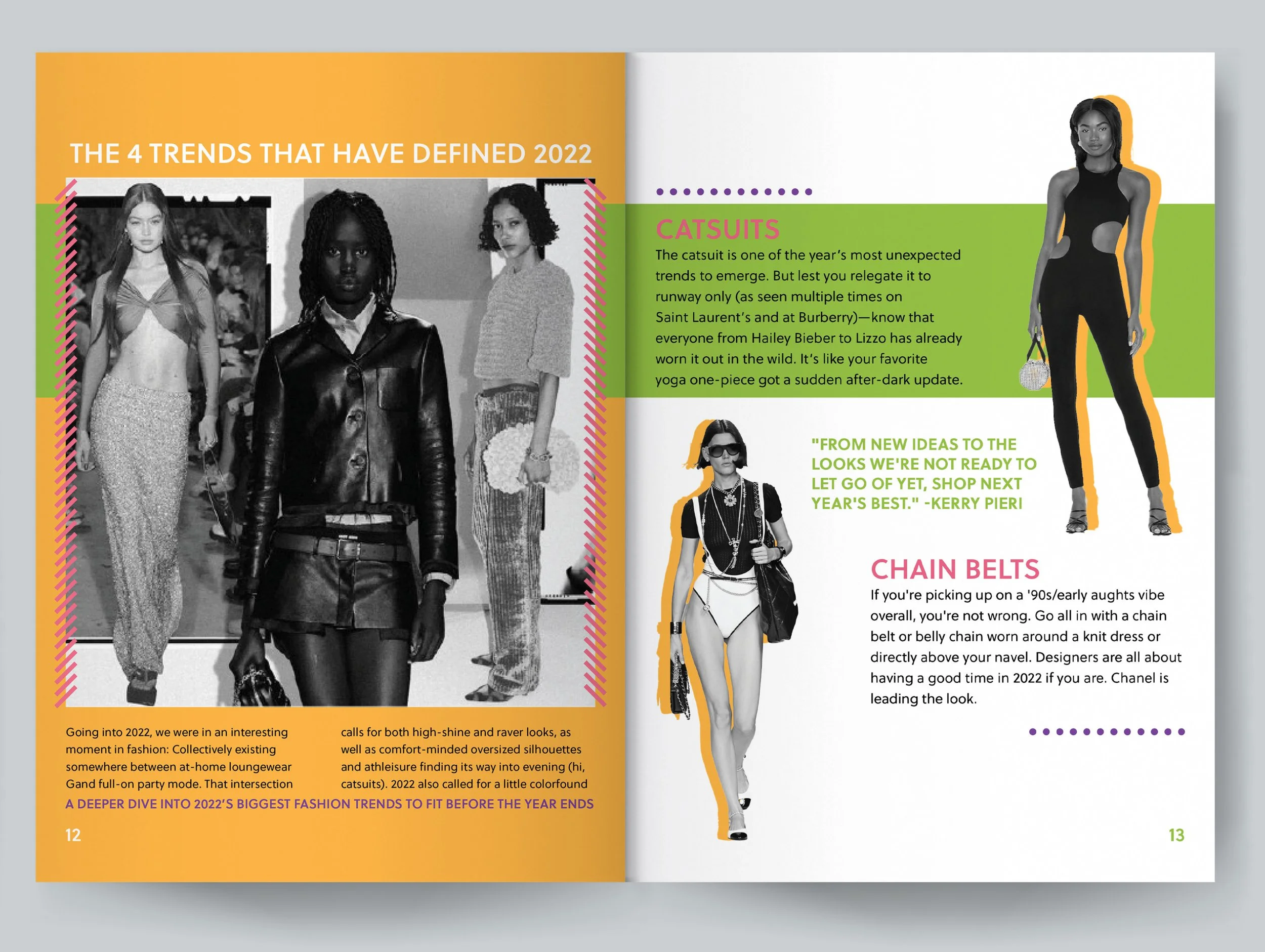

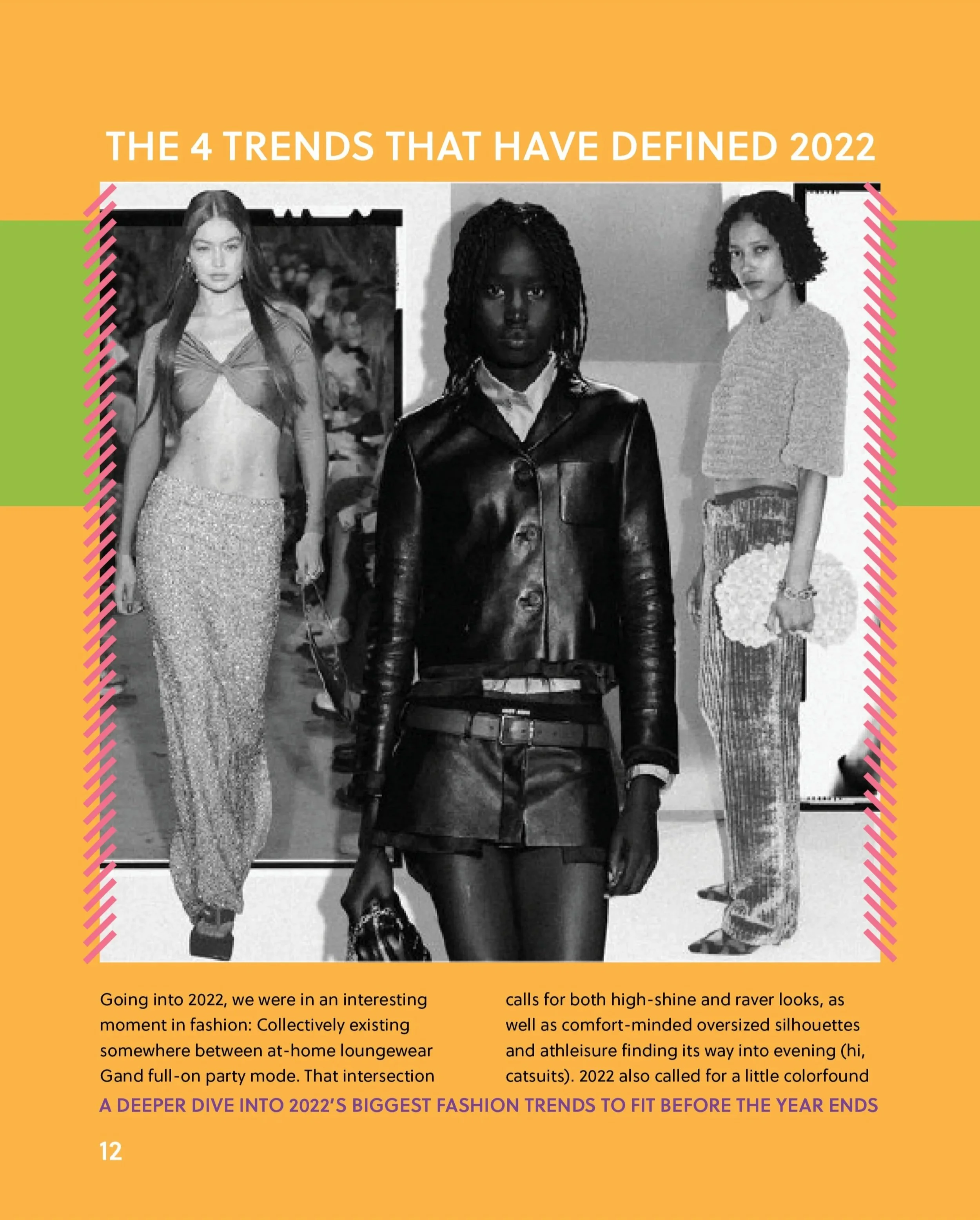
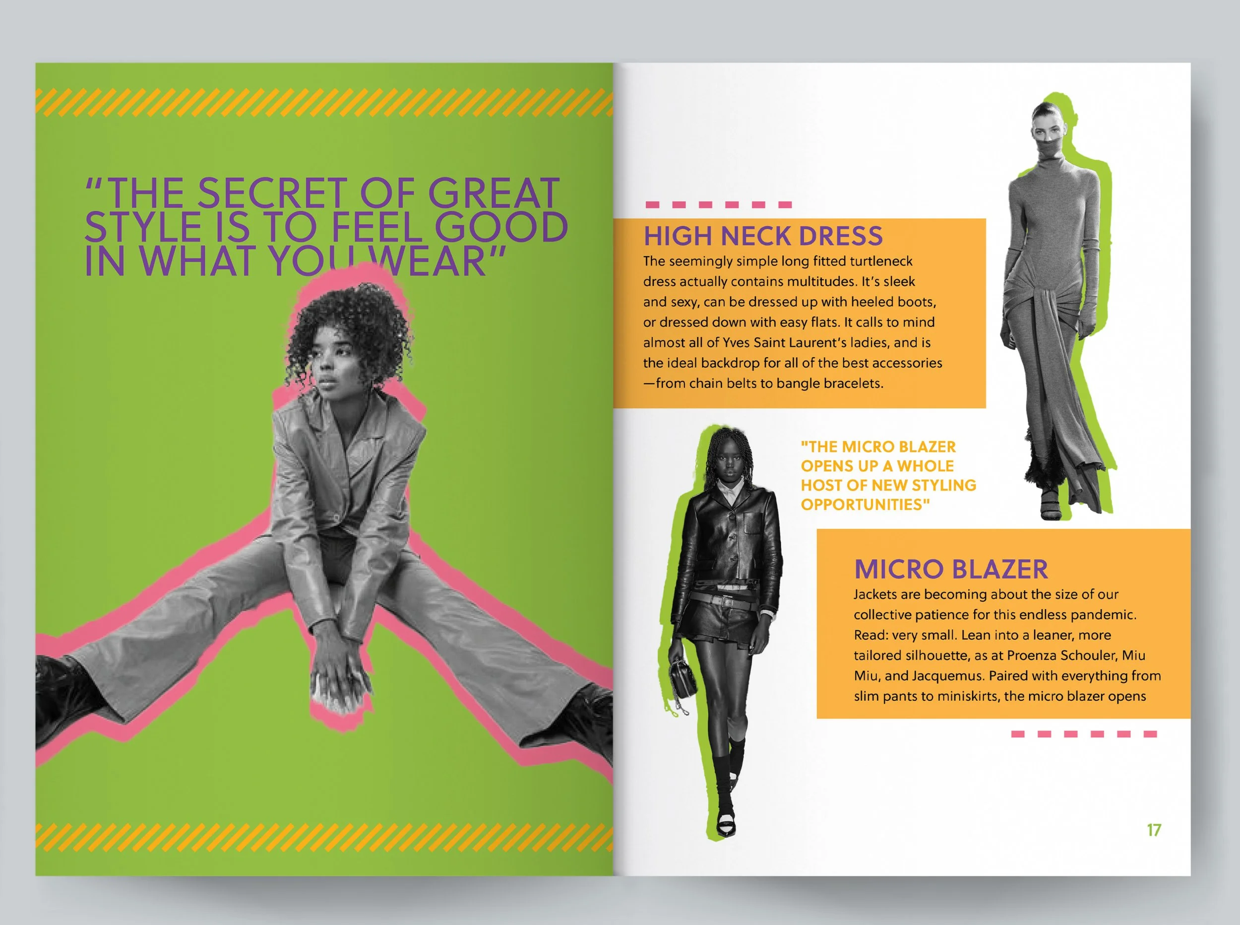
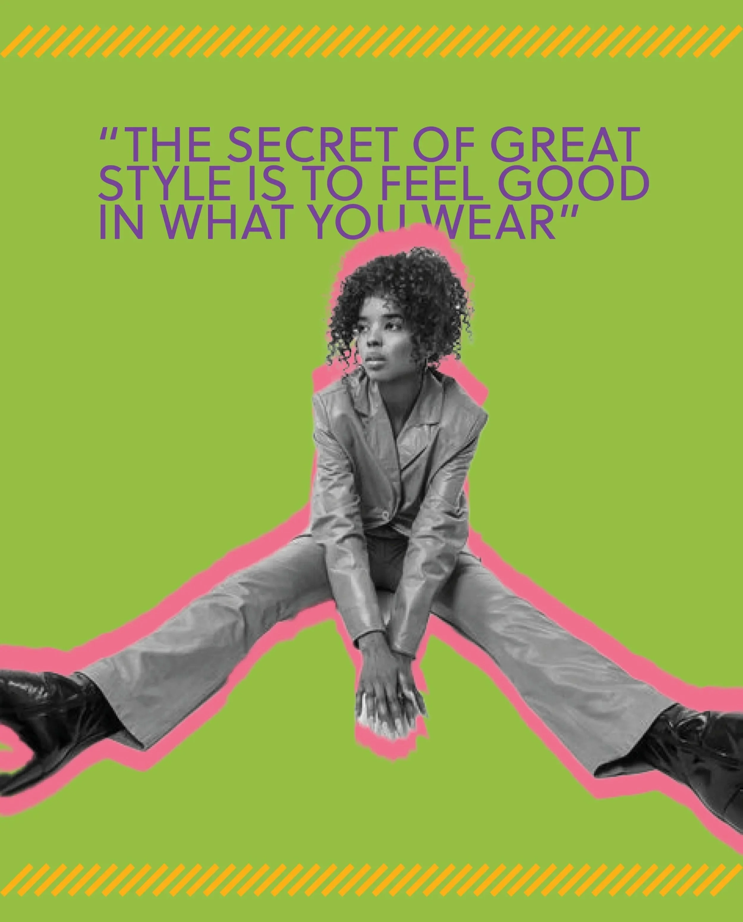
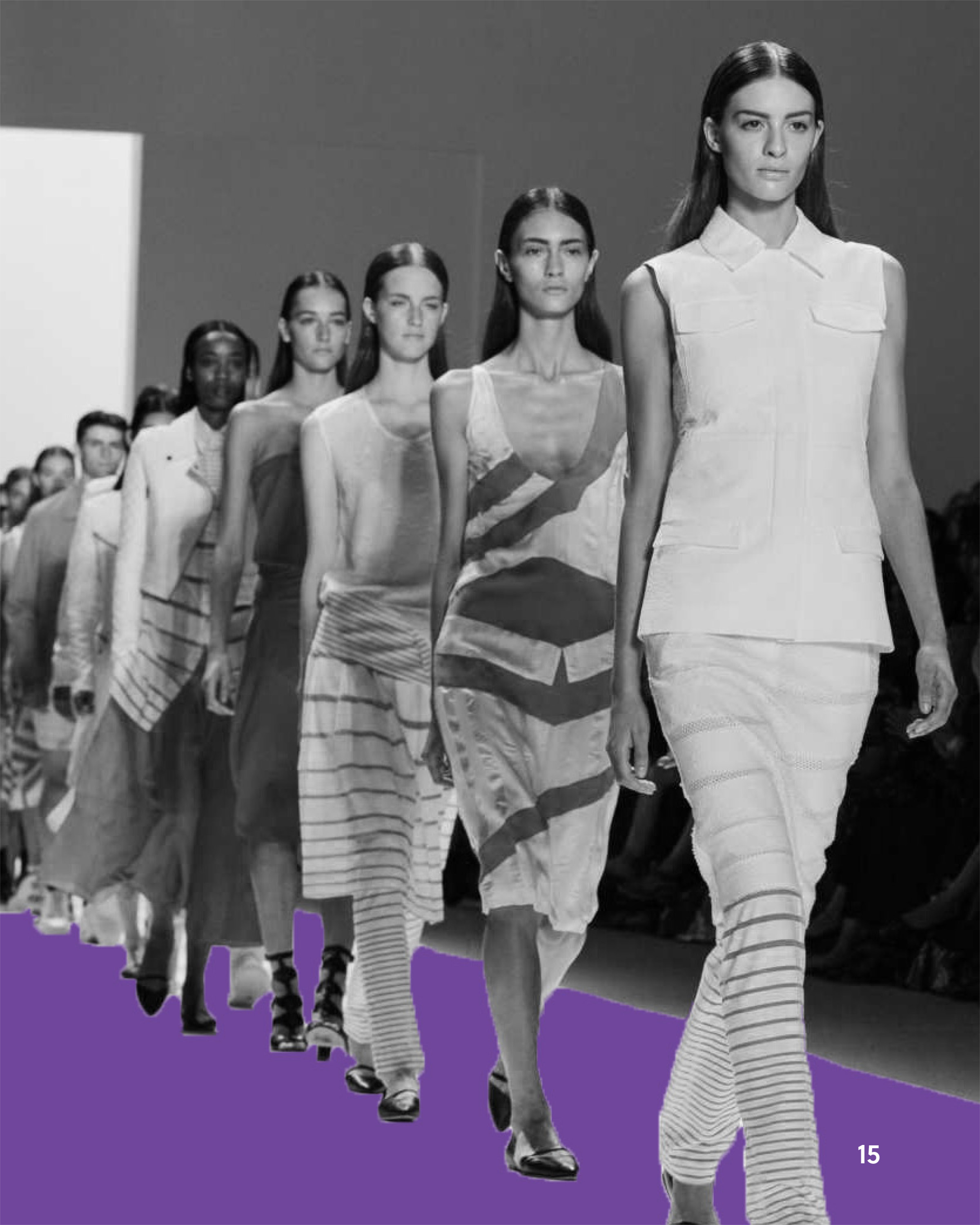
I chose to render the figures in black and white to create a clean, timeless foundation that keeps the focus on form, silhouette, and styling without distraction. By stripping away color from the subjects, I was able to emphasize the structure of the garments and maintain visual consistency across the spreads.
To contrast this, I introduced bold, colorful shadows behind each figure. This technique brings energy and a contemporary edge to the layouts, aligning with the trend-focused theme of the magazine. The vibrant shadows act as a visual bridge between the editorial imagery and the overall color palette, helping to unify the design while also creating depth and separation from the background.
This combination allowed me to balance minimalism with bold expression—highlighting both the fashion itself and my personal design style.